E-Commerce Website Design: Boosting Conversions for a Fashion Brand
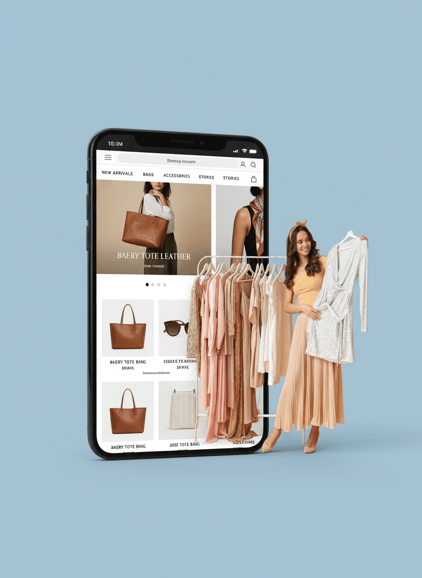
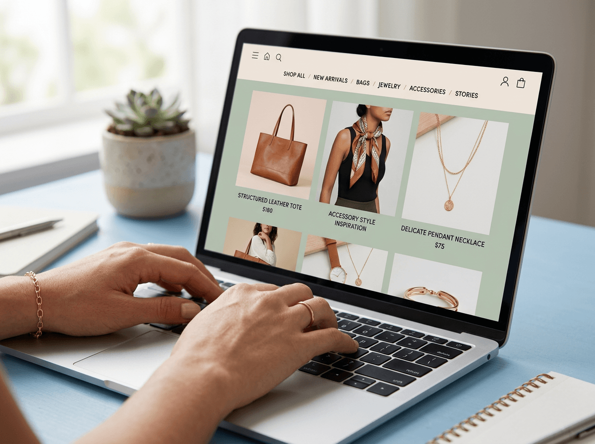
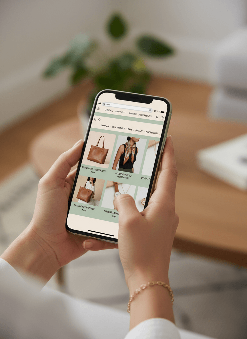
A fashion e-commerce brand was attracting traffic but struggling to convert. High cart abandonment and a poor mobile experience created friction at critical moments in the customer journey.We redesigned the website with a mobile-first approach, streamlined navigation, and a frictionless checkout experience, transforming how users interacted with the brand and significantly improving performance.

increase in conversions
cart abandonment
mobile engagement
The Opportunity
Before partnering with Consera Creative, the brand had strong products and consistent traffic, but the website experience wasn’t fully aligned with how users browsed and purchased, especially on mobile devices.
As mobile usage continued to grow, gaps in the user journey became more evident. The opportunity was clear: simplify the experience, reduce friction, and create a seamless, intuitive path from discovery to checkout that supports conversion at every stage.
The goal
CREATE A SEAMLESS, MOBILE-FIRST SHOPPING EXPERIENCE THAT REDUCES FRICTION, IMPROVES CONVERSIONS, AND DRIVES CONSISTENT E-COMMERCE GROWTH.
The Challenge
Despite steady traffic, the website struggled to convert users effectively due to several key issues. High cart abandonment during checkout, a poor mobile experience, and complex navigation slowed down user journeys and created friction throughout the purchase process. In e-commerce, even small moments of friction can lead to lost revenue, making the overall experience just as important as the traffic itself.
TURNING EXPERIENCE INTO MEASURABLE GROWTH
Customers don’t just browse; they decide quickly. We approached this as a user experience problem, not just a design update. Instead of focusing on aesthetics alone, we focused on how users navigate, interact, and convert.
By simplifying the journey and aligning design with user behaviour, we created a seamless experience that guided customers from product discovery to purchase, without unnecessary friction. Because in e-commerce, clarity and ease are what turn intent into action.
We didn’t approach this as a design problem; we approached it as a friction gap between user intent and conversion.
What We Did
We approached the redesign as a complete experience transformation, ensuring every interaction supported conversion.
We implemented a mobile-first design strategy, prioritizing speed, clarity, and usability across all devices. Navigation was simplified to help users locate products faster, while product pages were redesigned to highlight key information and build purchase confidence.
The checkout process was streamlined to remove unnecessary steps and reduce drop-offs, creating a smoother path to purchase. At the same time, we improved overall site structure and user flow to guide users more intuitively through the journey.
Every decision was made with conversion in mind, reducing friction, improving engagement, and making it easier for customers to take action. The result was not just a better-looking website but also a more effective system for turning traffic into revenue.
The Impact
In just three months, the redesigned experience led to a 30% increase in conversions, a 25% reduction in cart abandonment, and a 40% rise in mobile engagement.
By aligning design with real user behavior, the brand didn’t just improve its website, it created a more intuitive, high-performing shopping experience that consistently converts.